Showing posts with label DIY. Show all posts

Tuesday, March 3, 2015

Finding your Design Style

Today I was asked in person and online if hiring an interior designer is a good idea. The answer is it depends.

But do you really want my full opinion on the matter? Really? Because what is seen cannot be unseen. Once you enter my world of paint color obsession and texture, style, proportion, and lighting you might never be the same.

I'm telling you, if you just wrapped up a remodel or already spent your hard-earned money on style advice turn back now.

OK, you can't say I didn't warn you...


The above pictures, do you like them? If you think they're great then, really, stop reading. But if you find them lackluster, or even soul-crushing (as I do) then we have something to discuss. 

As I see it, there are three groups of people (in the non-trade world): 
  1. Those who have no strong feelings about design whatsoever. They want to buy their furniture in sets and have it done with. Paint color? Whatever the builder recommends. They don't really need an interior designer. In fact, one would be wasted on them. 
  2. Those who love HGTV and gush over the design tips in their Real Simple magazine. They can tell good design from bad design, but they have no idea how to implement this into their own home. They should really consider getting an interior designer. 
  3. Those who are well-versed in design. They speak of color undertones, gush over Farrow & Ball, follow design blogs religiously, and scour E-bay & Etsy for the best deals on Hamedan rugs. They know so much they might try to do it all themselves, or they know enough to realize they could benefit from expert consultation. It can go either way. 
If you're a #2, can you become #3? Absolutely! It will take some time, of course. I recommend the following "homework." 

Books

Amazon

Amazon

Amazon

These are the go-to books for design-enthusiasts. I should have also thrown in some Nate Berkus because, hey, we all love him. Something I really appreciate about the Domino book is that from the start it recommends that you define your own style, really pay attention to the sorts of things that tickle your fancy. I advise getting a Pinterest account, if you don't already have one, and take a pin first, think later approach. With time you'll start to see your tastes emerge. You might be shocked to find a love for, say, dalmatian print wallpaper. Who knows?! Go ahead and surprise yourself. I sure did with my own board. The other two books are meant to get your creative juices flowing with DIY projects and ideas. 

Blogs

Start your day with a post from your favorite design blog. Really, give this a try. This is hard to make recommendations about because people vary so much when it comes to taste, but here's a sampling that might help get you started.


Finally, I do believe that anyone who gives a darn about what their surroundings look like should follow Apartment Therapy --I mean, just look at today's post: The Four Commandments of Decorating More Confidently-- and purchase Maria Killam's E-books. The latter should be required reading for anyone who is making costly decisions about their home like tile and counter-top selections. I really do mean that. I can personally attest that after learning a bit about color theory and clashing undertones, I was able to save us from making a mistake that would have cost us thousands of dollars. 

At this point, someone might say, oh forget it, I'll just ask for an in-home consultation from my favorite furniture store. With that there are many parallels to the fashion world. If you were to hire a chain-store wardrobe stylist, what s/he'd give you is actually not style. It would be the current fashion trends. That is what other people think looks cool right now. Style, on the other hand, is a combination of confident, personal choices that result in visual art. Likewise, if you want your home to look exactly like the current Pottery Barn catalog, then go right ahead, but realize that it will shortly become outdated and fail to inspire. In contrast, those who actively choose their decor, and layer on piece after piece, create something that tells a story about themselves. The result tends to be beautiful and timeless.

See for yourself, and contrast the following images to the ones with which I started this post. Cleanse your palates, and be true to yourself. Even if that means enlisting help from the pros. After all, there's no shame in asking for help... unless you actually want pink beige in your home. :)


Source

Source

Source

Source

Source

Source

Source

Sunday, November 30, 2014

He Thinks He's a Stud

No, it's not staying in the kitchen.

I could confidently type that post title and know that no one reading this would think I'm talking about Tim. Because, oh man, we all know what a stud he is. I was referring to this banquette seating we scored at Baxton Studio Outlet the other day. It was tagged as $260, which I thought was a very good price to begin with, but then the sales associate told me it was 50% off as part of a holiday sales promotion and oh snap, you know I acted on that. 

Thing is, this banquette seating is intended to go with a very industrial-organic table from CB2 and that nail-head studding is just not going to jive with that. It says Hollywood regency wannabe. Trust me, it does. 

One down, only 383 more to go!

So though it may break a few hearts, and our knuckles in the process, we're removing each nail stud one by one. It's tedious, but for the price it's already worth it.

Saturday, July 27, 2013

Decisions: Wallpaper

Peeps, please help us out. This is not something we can afford to get wrong. The decision to wallpaper the powder room is a leap of design faith, we need some assistance to go through with it.

Subtle

Wabi Sabi Loop in Sand Beige

Bigger impact

Suzy Hoodless 'Jewel of Spring' in grey and chartreuse


Something in-between?

Suzy Hoodless 'Jewel of Spring' in light blue and creme

It's down to these three. The Wabi Sabi 'Loop' vs. Suzy Hoodless 'Jewel of Spring.' I like the shimmer effect of the latter, but worry that it might be too much for some people. I try not to decorate my home for others, but when it comes to something more permanent like this I have to think about eventual resale value. (Samples are from here, I have to return them soon.)

HELP!

Friday, May 3, 2013

The Middle-Crazy of the Nursery Continues

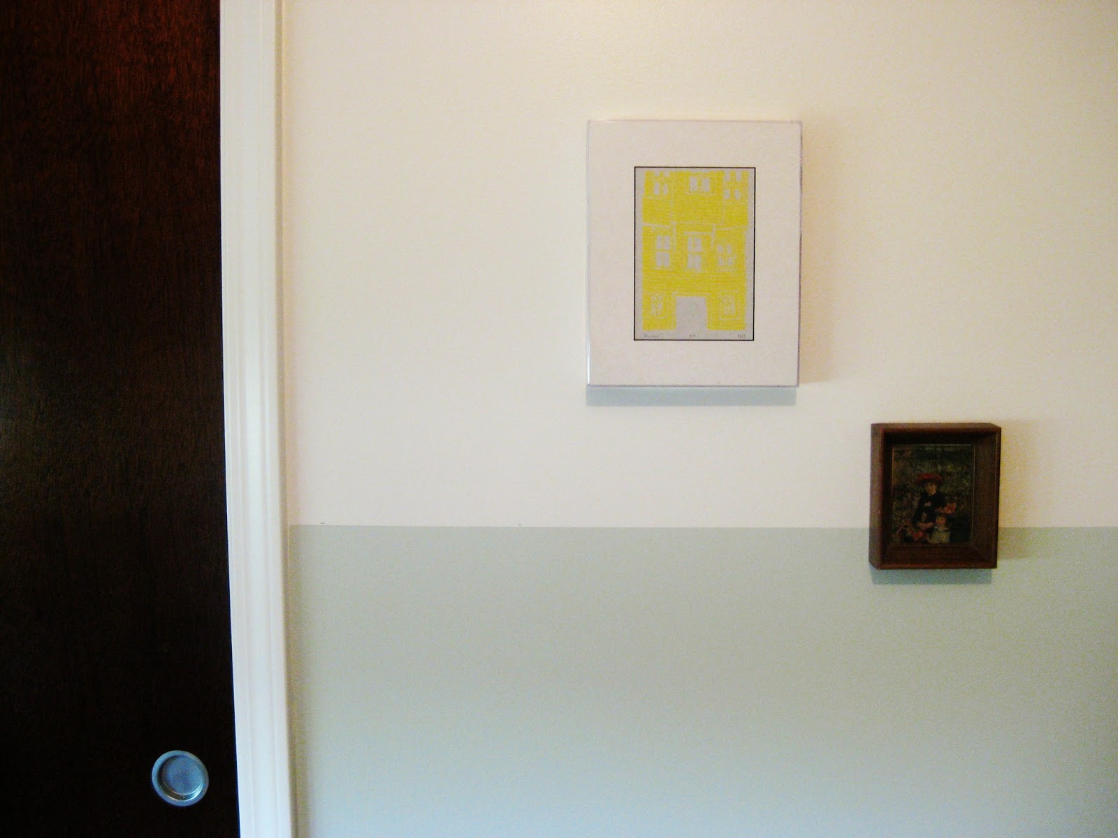
I went with that half-wall idea. And trust me, when you live in an older home with not-quite-flat walls and floors, this was no picnic to accomplish.


The upper wall is in Benjamin Moore's White Dove, and the lower is Gray Owl. This has been a color combo suggested over and over again on Pinterest, but funny enough I came to it on my own after comparing samples and later finding out their names. I suppose subconsciously I was influenced.


Been putting up artwork to break up the lines and that has been a lot of fun so far. We're going for a carefree eclectic look in here, so I basically grab whatever's on hand and use 3M command strips to stick it up there. I'm starting to run low on supplies, so that means I get to do some Etsy art shopping. I'm also loving a lot of what I'm seeing at Society6, so maybe I'll just have to grab something there, too. The prices are way affordable compared to stuff I've seen elsewhere. 


I still think the room looks disjointed and basically a hot mess overall, but I keep telling myself it will all come together in the end. -Which is hard to do because I don't exactly have a vision of that, I just try things left and right and tell myself that the rug you see there can draw it all together. . . or it will be my undoing.

Tuesday, April 30, 2013

Boy's Room: Hanging it Up

In order to keep the momentum up and get fragile stuff off the floor, we've been hanging a bunch of stuff on the walls. Turns out that makes a huge difference, at least for me.

Remember this sad little corner?


Now it's looking like this:


I think it also helps that spring is finally here and we're getting better light in the house. Sunshine makes everything look so much better. It was motivating us to go on a wall-decorating frenzy.


This is all stuff we had at the other house, so it's nice to see them again, and this time in a new light. I know that for Leepo, having familiar items around him helps to cope with the move. He's doing OK these days, but those first couple of weeks were rough. The poor kid couldn't sleep well at night and went on to develop nocturnal hallucinations ("Mom, Dad, there was a glowing man in my room.") and the fatigue caused him to develop a sty! So glad we're passed that. Now this is his favorite room in the house and a place in which we all enjoy playing.

Monday, April 29, 2013

Progress in the Office

Things are finally starting to fall into place. Actually, change that to move into place. "Fall" makes it seem like all this progress happened passively when really a lot of planning, sorting, cleaning, organizing, staining painting had to take place beforehand.

I did end up painting the walls after all. That dingy taupe had to go. When I went to pick up some fresh paint, Home Depot Steve wasn't there and I got H.D. Mark, instead. Oh, Mark, he humored me as I agonized over the subtle difference between Martha Stewart's Pure White and Glidden's White on White. Eventually the latter won out because I felt it had a better balance of red and blue tints. I mean, obviously, right?


I should say that I made some interesting choices when it came to picking color(s) for the office. At the end of my staining debacle with the office cabinets, I conceded to paint and couldn't even process what I was about to do. In DIY survivor mode, I asked a friend who has an affinity for painting furniture what color she used last and simply copied what she did. No weighing the pros and cons, no pondering the undertones, nada. I just did it and hoped for the best. I ended up with Behr's Puddle as I mentioned earlier

Since I was feeling kinda crazy gutsy, I didn't stop there with the bold choices. I took that purple/brown/grey color and paired it with red accents. RED! That color already has a reputation for making a scene, but keep in mind that right now in the design world we are hooked on greys and subtle neutrals. This red is coming out of nowhere. And I like that.

So without further ado, this is what things were looking like when I realized those walls needed to be painted:


And this is what we have going on now!

I won't advocate for painting wood, but I think this turned out OK.

Temporary desk chair, or not. We'll see. 

What you see on top of these surfaces is not permanent either. Just stylin'.

That file cabinet is the real workhorse here. 

Gratuitous library shots

Had to zoom in on our cuddles. 

Mas mejor, ¿no? I might actually get some work done these days!

Thursday, April 25, 2013

Office, The Brain of the Home

Scheme for the office

The most important room in the house for the maintenance of sanity is the office. This, unfortunately, has been the last room to come into its own. By now you know about the epic cabinet debacle (at least half of my sanity perished with that alone). . . Well, those paint victims are now sitting pretty, just waiting to house books on risk management and diseases of muscle and nerves. I also acquired that beautiful spotlight desk from the C&B outlet. The red kilam rug is from West Elm (still on sale) and will go in the center of the room.

I'm really, really tired of painting, so I kept trying to convince myself that the current wall color would be just fine. The truth is, it's a dingy taupe that clashes horribly with the cabinets, which are painted Puddle by Behr (represented by that purple grey rectangle in the corner).

So now I'm moving things around in the office to prepare it for some new paint this weekend. I'm playing with sample colors in the top right corner. I think going with something lighter will make the cabinet and rug really pop. I had actually wanted to try something darker, more moody like a plum, but I just don't think it will work this time.

I grow impatient to get this all done with, but I know I should be a good girl and try paint samples. The upside to all of this will be the great likelihood of seeing Home Depot Steve. The downside will be having to report back to him on how my staining project went. . .

Friday, April 12, 2013

Cabinet Debacle

Otherwise known as that post where I come out as a hypocrite and a charlatan.

I've been known to condemn speak out against those who paint over perfectly good wood. For me, it's like watching a senseless killing in the animal world. Thus I have long promoted staining over painting furniture, which I must say is against the grain (get it?) these days in case you haven't noticed the paint-everything-that-doesn't-move trend on blogs everywhere.

So, when I purchased a set of three wood cabinets to go in our office, I was excited and determined to enhance their wooden goodness with a staining project. Naturally, I consulted with Home Depot Steve.

Besties

Home Depot Steve doesn't mess around. You don't go to him to hear what you want to hear. He won't put his head in his hands and say you won't regret painting your bedroom in puce. No, Home Depot Steve will  give it to your straight with a combination of Chicago brashness and Midwestern sensibility.

Me: I need to stain three large wood cabinets. I do NOT want to sand them.
Steve: You want the Polyshades, eh? (Miniwax)
Me: Yes, how did you know?
Steve: [Smiles like the answer is obvious]
Me: Can I get away with it?
Steve: What's the finish like?
Me: It's a light wood with, well, I gotta say the finish looks a bit pink if you can believe it.
Steve: [Looking concerned] You have to degloss it. Here, let me show you where the deglosser is and some rough surface cloths.
Me: No! "Rough surface" sounds like I'm sanding. I don't have the strength or time for that!
Steve: Listen, you know why your cabinets are pink?
Me: No. . .
Steve: They're old, retro right?
Me: Yes. . .
Steve: [Drops the bomb]  They were WHITE WASHED. Old white paint turns pink over the years.
Me: Steve, you know everything.
Steve: I know you need this deglosser.

So, out I skipped with some deglosser, rough surface cloths, brushes, and a can of Polyshades finish. What happened next was definitely not Steve's fault, for I had been warned.

First Mistake: NOT deglossing

"That Steve, he's not the boss of me."

I started to degloss, I really did. But then the fat, lazy devil sat on my shoulder and told me that an experiment should be performed first. I compared a deglossed section to an untreated one and couldn't tell much of a difference. I, of course, then proceeded to do it the "easy" way. (This would actually make for more work later on.)

Second Mistake: Brushing against gravity.
I would come to find that when working on huge projects like this one, setup is everything. If you want a good finish without brush-marks or drips, you gotta lay things flat. Yes, even big heavy things.

"Oh snap, what are those?"

Things looked like they were going well, until these guys showed up. Look closely, they're lines perpendicular to the grain where my paint brush had stopped abruptly. I quickly realized that to get a smooth look, I'd have to go from one end of the cabinet to the other uninterrupted. This could only be done by laying it flat.

Third Mistake: Underestimating the White-Wash Effect 

Oh. No.

At some point I repented. Things weren't going well and I decided to go back and do it the right way. I laid everything flat, I wiped off all the stain (the fact that I could do so points to the need for deglossing) and started over again, but this time I deglossed first. I used the rough surface cloths and a steel wool pad. I spoke to my bishop about it.

But no matter what I did, there were parts of the cabinet that wouldn't soak up the stain evenly, causing the effect you see above, presumably because the original paint/wash had seeped into the grain. --Not shown is how I proceeded to stain all three cabinets twice, hoping this would somehow improve.-- At this point, I had terrible neck pain and tension headaches. We also missed a bill payment because we were (and still are) an unorganized mess without an office, where these cabinets are intended to shape things up. Tim finally put his hand on my shoulder and said, "We've done all we could to save them."

Boom. Just like that my dreamy wood cabinets flat-lined. This was followed by the truly unthinkable. . . Yep, I primed and painted them. And I still feel dirty about it.

Goodbye hopes and dreams!

Whenever I get really down on myself, I have to remember that I didn't give this wood the fatal disease. Whoever white-washed them critically injured this furniture. I was more like life support. . . and was hand-held into pulling the plug. RIP wood.

Wednesday, February 20, 2013

Let's Not Forget the Dungeon

There is an underground lair that hasn't gotten much exposure on this blog. That's the thing about ranches, because they're so wide, the basement space is equally impressive (more like overwhelming for me).

What we're working with is, of course, mostly unfinished. There is, however, a spare bedroom that's getting close to completion relative to the rest of the basement. It's not high on our list of priorities, but since we were donating a lot of things yesterday, we decided to sweep through and open up the room a bit.

Right side

Left side

Spare room, upper shelving and laminate tops removed

The idea will be to put down a unifying countertop here and get some doors on those lower shelving units. That large white block on the left actually houses some built-in drawers on the other side. Since we don't actually intend to have someone living downstairs in this room, its usual purpose is intended to be an art/craft and sewing area. The time has come then for me to learn how to sew.

Friday, February 15, 2013

Work in Progress Home Paint Scheme

Original

Blocks of paint color options denote the samples I'm looking to test drive first. Any thoughts, comments, or recommendations?

Note to potential burglars: I am not showing doorway entries and this scheme is not true to scale or layout. Also, we invest in things like tile, not TVs or jewelry. How did you end up on a design blog, anyway?

"Final," click to enlarge

Friday, December 28, 2012

Goodbye First Home: Kitchen

Prep area and tiny eat-in

Window + sink = important

Brown, tangerine, and gray.
We made it work.

When we moved in, the walls were covered in gingham-style (heyyyy, sexy ladies!) wallpaper that was incredibly difficult to remove. If you're wondering why we got rid of it, you might be imagining J. Crew prep when, in reality, it was more country charm (think geese with bonnets, instead). Once we got all that off, we selected a warm gray to go on the walls. From there, we repainted the cabinets, changed up the hardware, and switched out the counter tops. Eventually, we went stainless with the appliances (January is a good time to buy).

We also reconfigured the room where we could. It wasn't a classic, functional kitchen setup before. It was somewhere between L-shape and galley, without the desirable 'triangle' of work stations. Now the pantry and prep area are much closer to the fridge and sink. We made that stainless steel table by drilling an IKEA counter top to two Elfa shelving units. You'll note the neon green clip on the mesh shelves therein, this is to keep the kids from pulling them out or, worse, getting their heads caught underneath. (This is not mommy-doctor approved!) I will say that the nice thing about this contraption is it has wheels, so it can actually be moved to the middle of the kitchen and act as an island and put back afterwards. We also made good use of wall space, which is always critical in a small, heavily trafficked area.